In today’s world, having a website for your advisory firm is a must. But with nearly 2 billion results for “financial advisor” in Google, standing out from the crowd is more challenging than ever. If prospects can’t find you online, they may find a competitor or even turn to a robo-advisor. When done well, a website can be an essential marketing tool for any firm looking to attract prospective clients and engage the ones they have.
At its core, an advisor’s website should serve at least three purposes:
1. Introduce Your Services
2. Build Trust
3. Gather Information
For a website to be successful, it needs to address these requirements and be well-designed, which is no easy feat. So we’ve gone through the entire internet (okay, maybe not the whole internet) to highlight the top 20 financial advisor websites of 2020 and how they’re able to accomplish these goals. We’ve called out some takeaways and hope it provides some design and concept inspiration for your website!
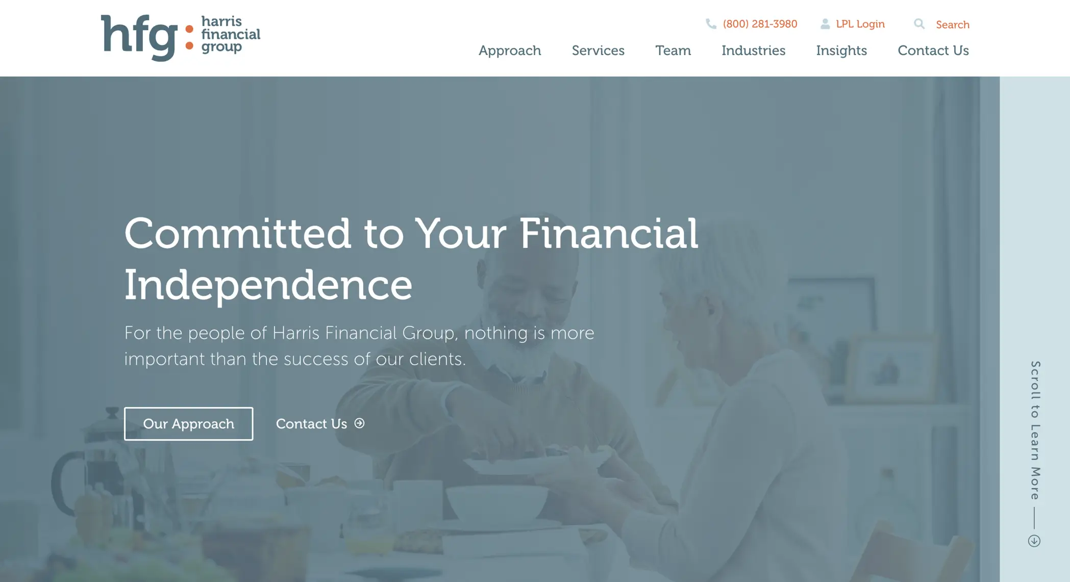
1. Harris Financial Group |www.harrisfinancialgroup.com
The first thing you see is the comprehensive range of advising services offered by the firm. The homepage lists five sections: services offered, team listing, a highlight of their target industries, recent news, and a contact form. Sleek design and straightforward navigation set the Harris Financial website apart from so many others. The minimalist approach also demonstrates who they are and keeps the focus where it belongs. The clear call to action (in this case, the “What’s Your Risk Number?” button at the top) captures prospects’ information in an inbound, non-salesy way. Their simple layout also converts well into a mobile format.
LESSON LEARNED: KEEP IT SIMPLE
2. Simonet Financial | www.simonetfinancial.com
It’s no wonder that an advisory firm led by Bill Simonet would lead with transparency. The team at Simonet Financial knows their audience and does a great job of establishing who they are as a firm and who they help. The little touches of their tech stack, FAQ section, and pricing let prospective clients see their transparency – which goes a long way in establishing trust.
LESSON LEARNED: BE TRANSPARENT TO GENERATE TRUST
3. Stewardship | https://stewardship.pro/
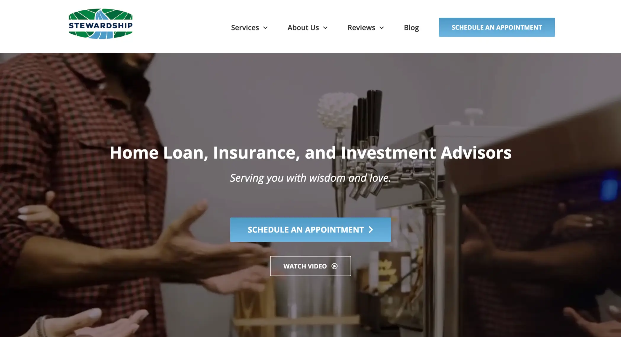 From the opening video to the informational graphics on the homepage, the Stewardship team uses every pixel to explain the how and why behind their client experience process. Right away, visitors are introduced to a video and a clear call-to-action to schedule an appointment. As you explore the website, you keep coming back to a clear idea: the Stewardship team is different, and they are ready to show you why.
LESSON LEARNED: TELL THEM HOW YOU’RE DIFFERENT
4. RLS Wealth | https://www.rlswealth.com/
RLS Wealth has polished its website to be consistent with their values. This approach is an example of branding done right; potential clients immediately come to a clear understanding of the firm’s purpose and mission. And what more could you expect from Justin Castelli, a wildly influential voice in the industry and co-founder of Advisors Growth Community? This website personifies the firm’s brand.
LESSON LEARNED: BRAND YOURSELF
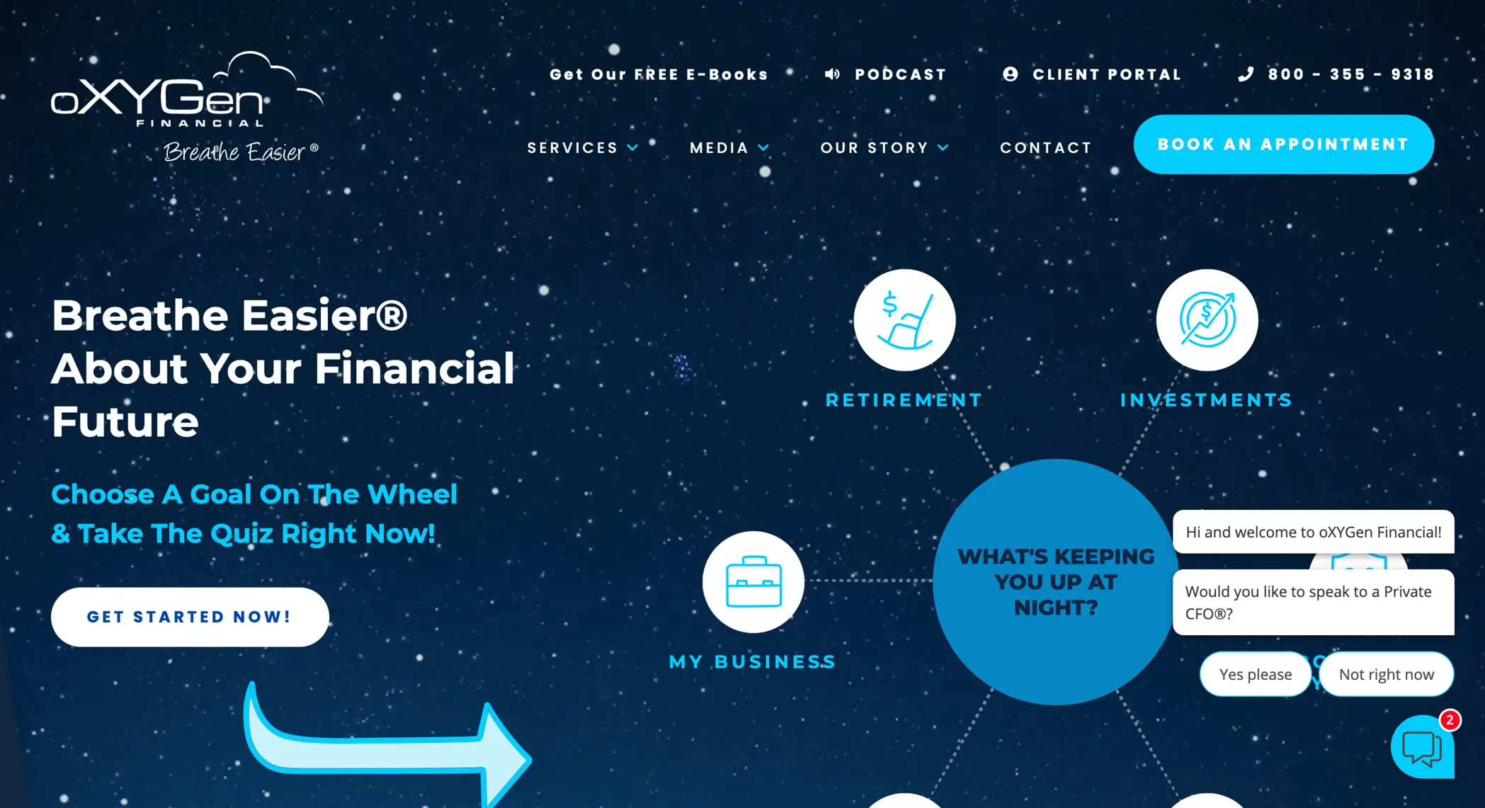
5. oXYGen Financial | https://oxygenfinancial.com/
The team at oXYGen has recognized that it’s not enough to have a website—you need to have a good one. This website wins for the most creative concept and here at Nitrogen, we kept coming back to the ingenuity shown through the creative design and intuitive interface. A website set in the stars isn’t something you’d typically associate with a financial advisor’s website – but let’s give them bonus points for creativity!
LESSON LEARNED: PROVIDE REASONS FOR VISITORS TO STAY ON YOUR SITE
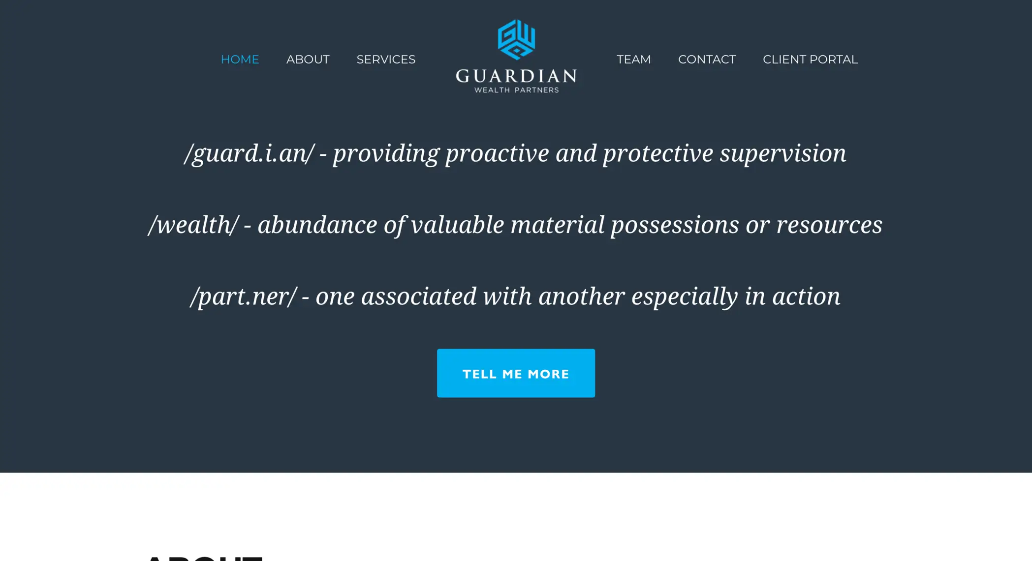
6. Guardian Wealth Partners | https://www.guardian-wp.com/
The firm’s first action of defining the meaning behind its name showcases expertise. With a simple design and quick access to the client portal, which gives investors immediate access to log in and check on their account balance and performance, Guardian Wealth Partners creates the foundation of trust that investors seek in their financial advisor. Often simple is better, and their team highlights this through the entire website experience.
LESSON LEARNED: TALK LIKE AN EXPERT
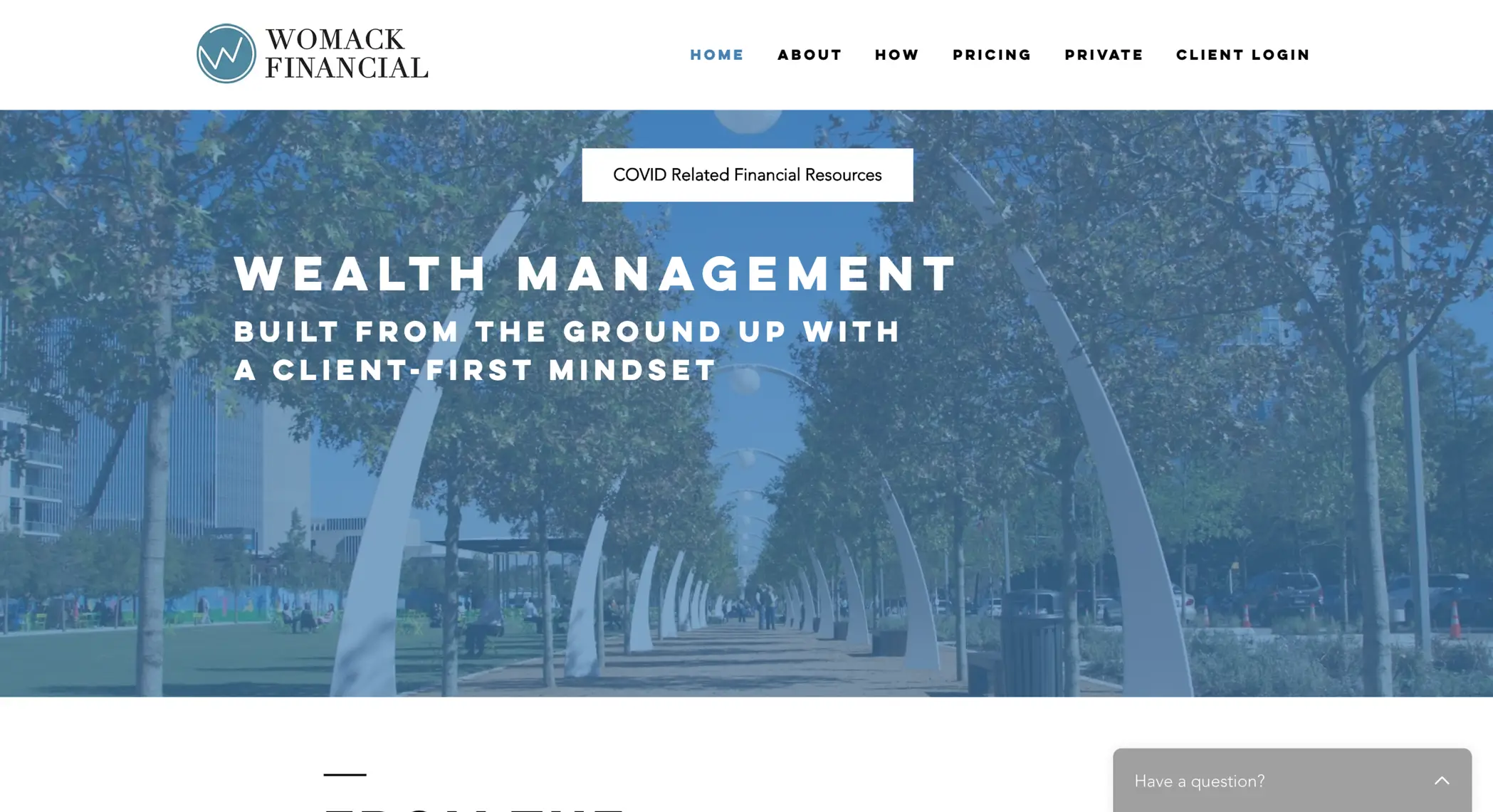
7. Womack Financial | www.womackfinancial.com
Womack’s mantra of a “client-first mindset” fits in with the site’s slick look, and the values of mutual trust, communication, and transparency are visible throughout the site’s design. Firms need to keep their core message in line with their website visuals. Making sure the two match means a better first impression and less chance for confusion – what you say and what that looks like go hand-in-hand.
LESSON LEARNED: HAVE THE LOOK MATCH THE MESSAGE
8. Define Financial | https://www.definefinancial.com/
The team at Define Financial created a website that not only works as intended on a desktop browser but transitions beautifully on mobile. Without any loss of functionality, clients and prospects have access to the case studies, downloadable resources, and complimentary appointment scheduling, whether on their phone or at their desk.
LESSON LEARNED: DESIGN WITH FUNCTIONALITY IN MIND
9. Global Wealth | https://globalwealth.ie/
We hop across the pond to feature the only international firm to make the list. The home page for this firm features beautiful, high-quality photos of Ireland, and with a name like Global Wealth, we’d expect nothing less. A list of client portals and pricing gives investors quick access to answer their most important questions.
LESSON LEARNED: EMPOWER CLIENTS WITH ANSWERS
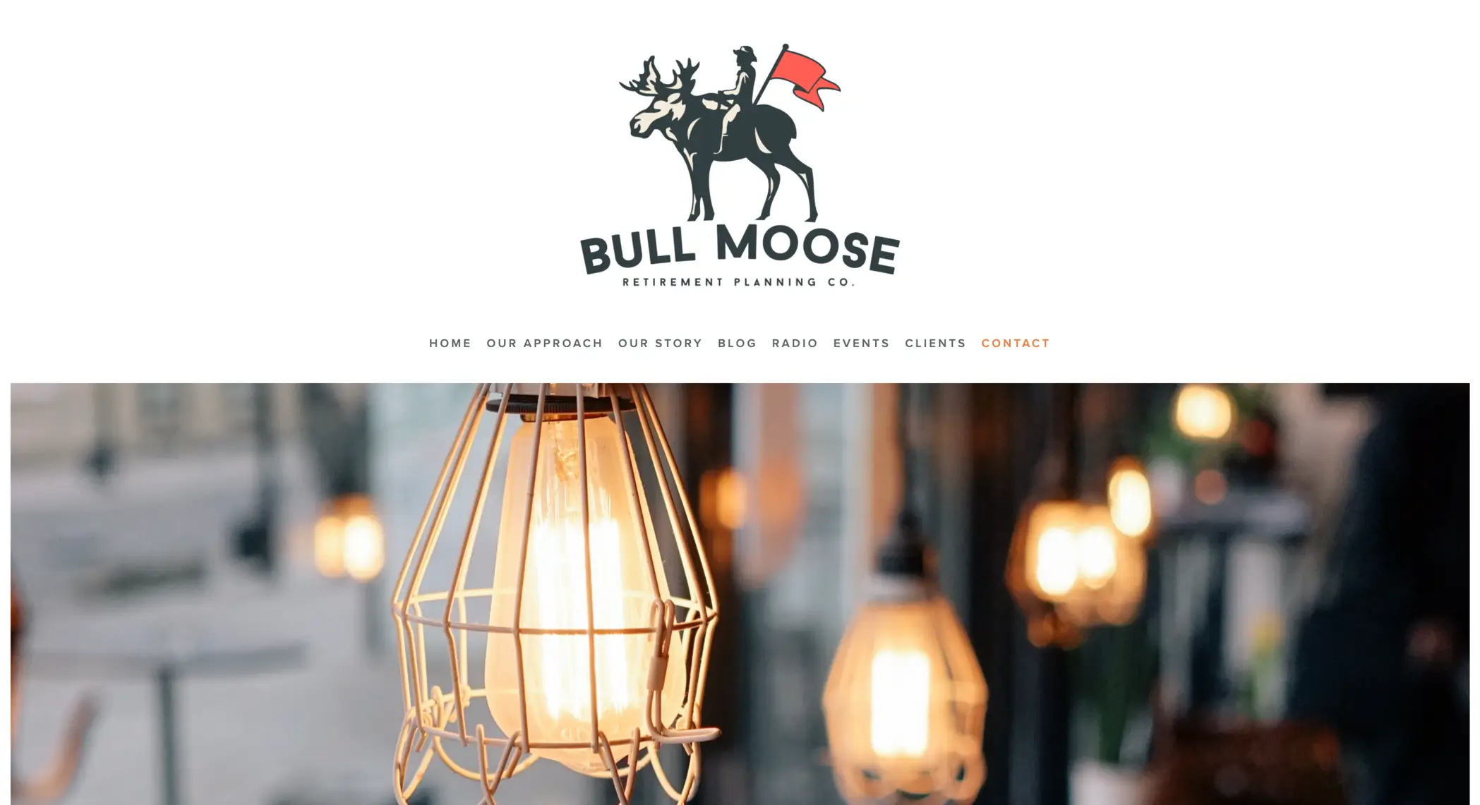
10. Bull Moose Retirement Planning Co. | https://www.bullmooseretirement.com/
Bull Moose Retirement introduces themselves with a classic, American aesthetic. The website uses clean design and high-resolution pictures to show quality – which can be a handy tool in demonstrating competency. “After all, if their site is good, I bet their other services are just as good…” Their message also describes their specialty: financial strategies for those in or nearing retirement. No-fuss, no muss (like Teddy Roosevelt himself).
LESSON LEARNED: HAVE A CLEAR MESSAGE
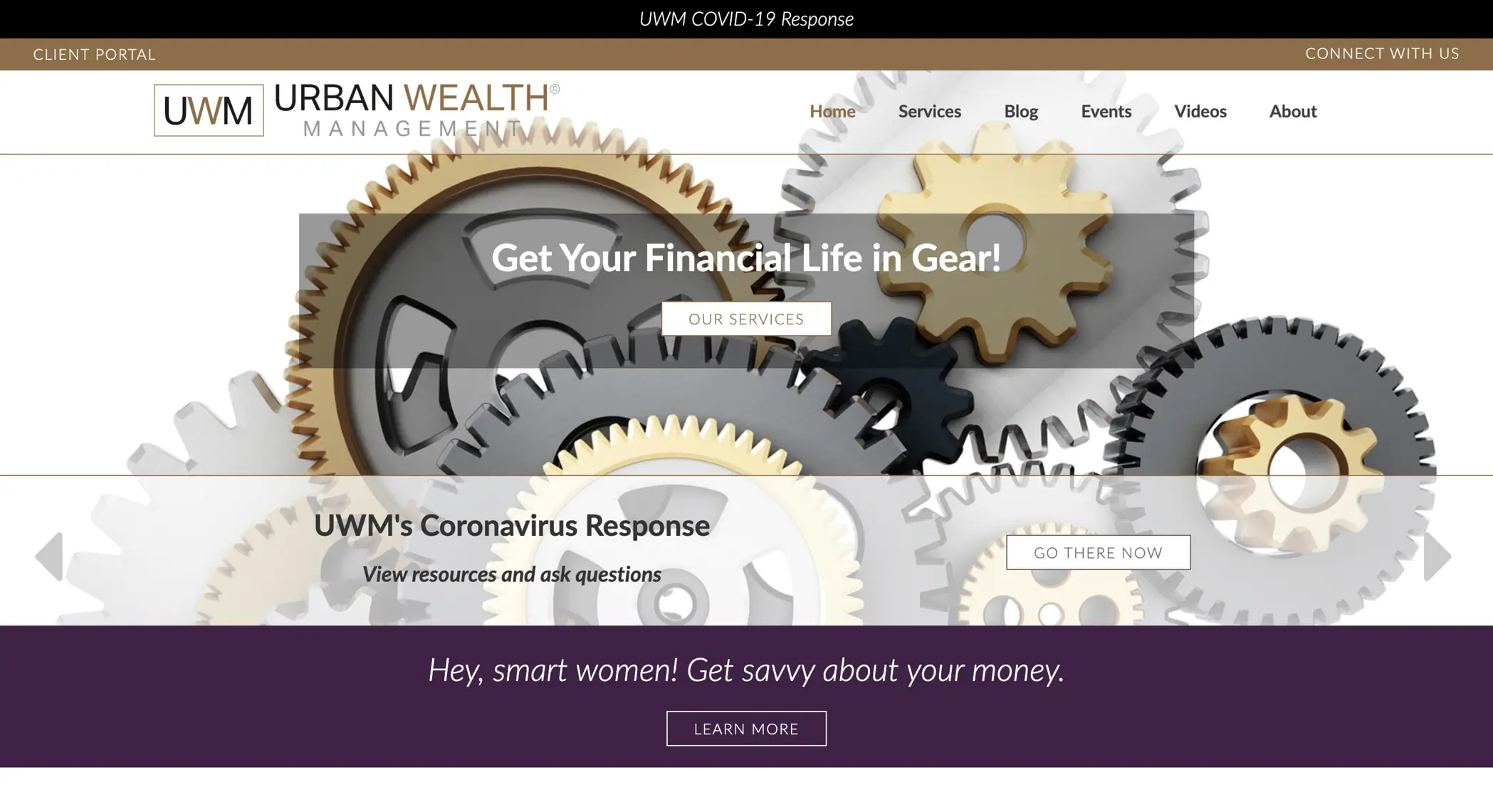
11. Urban Wealth Management | www.urbanwm.com
Based in El Segundo, California, this firm uses photos and graphic design to showcase its uniqueness in the industry. The firm’s mission seeks to help women with financial planning and determine their approach to wealth management. Their website’s crisp design affirms the bold mission. Their team is also featured prominently on the landing page, a good strategy for showing transparency.
LESSON LEARNED: MAKE YOUR MISSION KNOWN
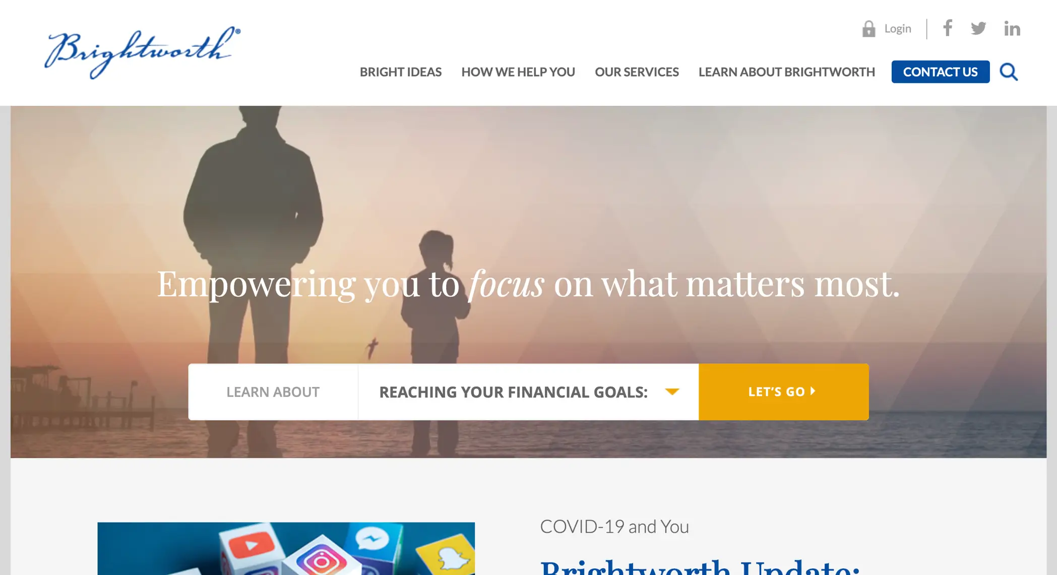
12. Brightworth | https://www.brightworth.com/
Theirs is the only website we could find that offered the viewer a personalized experience right at the start. Brightworth’s “Learn About” form with personalized links reinforces their offering as a “Private Wealth Counsel,” and that attention to discretion and luxury is well-represented from the first impression. These details are what high net worth prospects look for when choosing advisors.
LESSON LEARNED: KNOW YOUR AUDIENCE
13. Capital Investment Advisors | https://www.yourwealth.com/
Capital Investment Advisors (or CIA) shows how a domain name can be a powerful tool when creating an online presence. “Yourwealth.com” is a phrase that is easy to remember and often searched, which can be an advantage for those looking to increase site traffic. As a general rule of thumb, a URL shouldn’t exceed 13 characters between the dots. This firm also offers e-books and other content when visitors provide their contact information, which allows for a gathering and sharing of knowledge that benefits everyone.
LESSON LEARNED: THINK ABOUT YOUR DOMAIN NAME
14. Black Barn Financial | https://blackbarnfinancial.com/
This boutique firm in Austin, Texas, provides contact opportunities within seconds of the viewer visiting their page. By highlighting outlets such as its newsletter, social accounts, email, phone, and office location, local visitors will recognize the address and area code. The page highlights the firm’s activity in the community and how the founder, Sara Glakas, founded the Austin Women’s Investing Group. As a reader, It quickly becomes clear: Black Barn Financial serves and cares for the Austin community.
LESSON LEARNED: OWN YOUR LOCATION
15. Guelich Capital Management | https://guelichcapital.com/
This website focuses on an easy to use and pleasant experience for the site visitor from start to finish. Captivating photography of the Roanoke Valley and an emphasis on what makes them different is where Geulich Capital Management stands out from other advisor websites.
LESSON LEARNED: CATER TO YOUR COMMUNITY
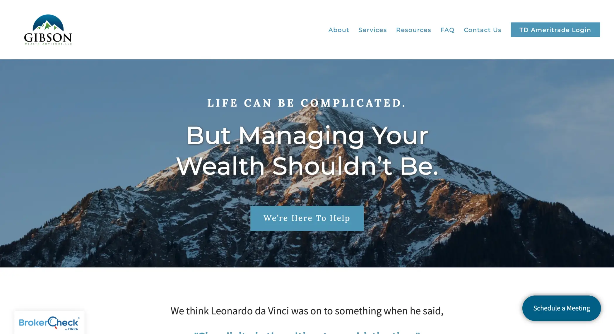
16. Gibson Wealth Advisors | https://gibsonwealthadvisors.com/
Beautiful design, adventurous imagery, and a canine on staff all make the Gibson Wealth Advisors website an excellent example of an advisor website to watch. The website offers a wealth of resources, including information for finding an investor’s Risk Number®, and the site is designed with accessibility in mind.
LESSON LEARNED: DESIGN FOR BEAUTY AND FUNCTION
17. Sammons Wealth | https://sammonswealth.com/
A website is a great way to provide visitors an understanding behind your perspective and approach to investing. Whether it is to attract an ideal client or highlight the firm’s culture, clients appreciate personal touches – in their advisor and their website. Another great tip: the home page highlights the clients that make the best fit with the firm.
LESSON LEARNED: DARE TO BE DIFFERENT
18. Sherman Wealth | https://shermanwealth.com/
From the list of media outlets to the instant call and text option, Brad Sherman and the team at Sherman Wealth offer visitors various resources. The website does a fantastic job of highlighting media outlets and news sources where the firm has been featured, which is an excellent way to showcase expertise in the field.
LESSON LEARNED: ESTABLISH CREDIBILITY
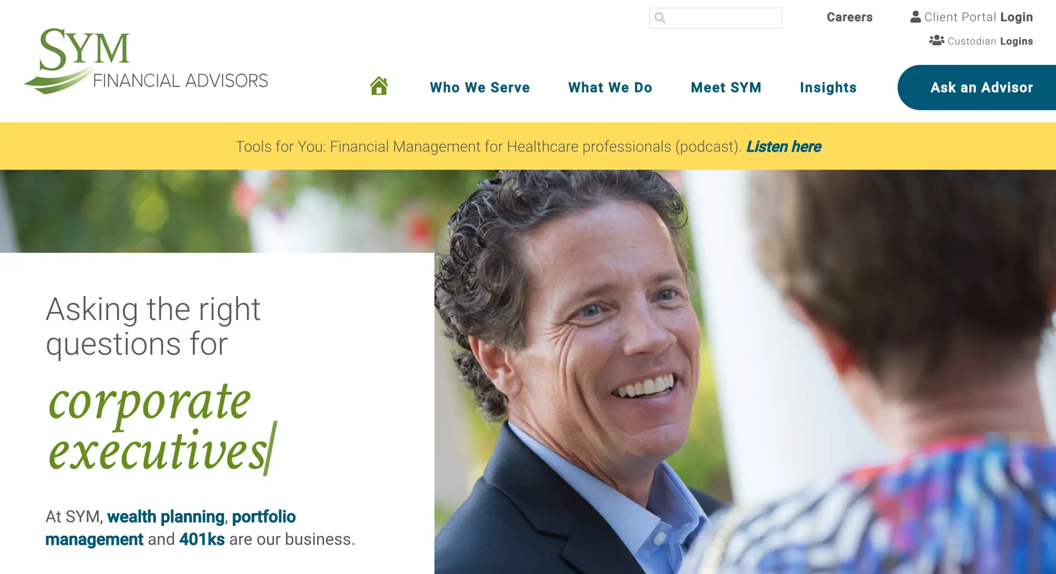
19. SYM Financial Advisors | https://www.sym.com/
The intentional strategy behind the SYM Financial website allows the firm to build trust and promote clarity to their prospects and clients. From financial tools to podcasts, the site serves as a resource and offers various options for the reader. Visiting your website through your client or prospect’s perspective can do wonders when building a space that confidently provides valuable information.
LESSON LEARNED: VIEW THROUGH THE LENS OF YOUR AUDIENCE
20. Berknell Financial

A website that features a professional visual, and a clear call-to-action, captures a visitor’s attention. But what separates the site is the emphasis on the firm’s culture and the value of an advisor. Berknell Financial provides a dedicated web page highlighting their firm’s culture, allowing prospective clients a behind-the-scenes look at what fuels founder Dasarte Yarnway.
LESSON LEARNED: SHOW YOUR CULTURE
We hope you find this content useful in your practice. The best advisors use their website to build trust and promote transparency to their prospects and clients. The lessons learned above all point to an intentional strategy to use a great domain name, promote their unique brand, and provide compelling resources to visitors. Utilizing all of the above, you should see a healthy ROI for your efforts.
Want to learn how to embed risk assessments into your site to capture prospects’ Risk Number and other meaningful information? The Lead Generation Questionnaire is a helpful tool to convert prospects into clients. Learn more here.

