
The Top Advisor Websites of 2024
How long does an advisor website really last?
According to one recent article from Forbes, the half-life of a website is about two years. If you’ve already spent thousands of dollars (or even tens of thousands) designing and building your firm’s website, that number might be a shock.
Luckily, a website revamp doesn’t mean you have to start from scratch – but it does mean you should take a look at what other firm websites are doing, check in with your clients about their user experience on your site and review any relevant site analytics.
As part of our annual series, we continue to evaluate the evolving landscape of advisor websites. For a look back at our previous selections, you can explore our top picks from 2023 and 2022, or visit our article Financial Advisor Websites: 9 Steps to Compelling, Value-Driven Messaging.
To help you get started, we’ve rounded up the best advisor websites on the web in 2024, what they’re getting right and how you can implement these same strategies on your own website.
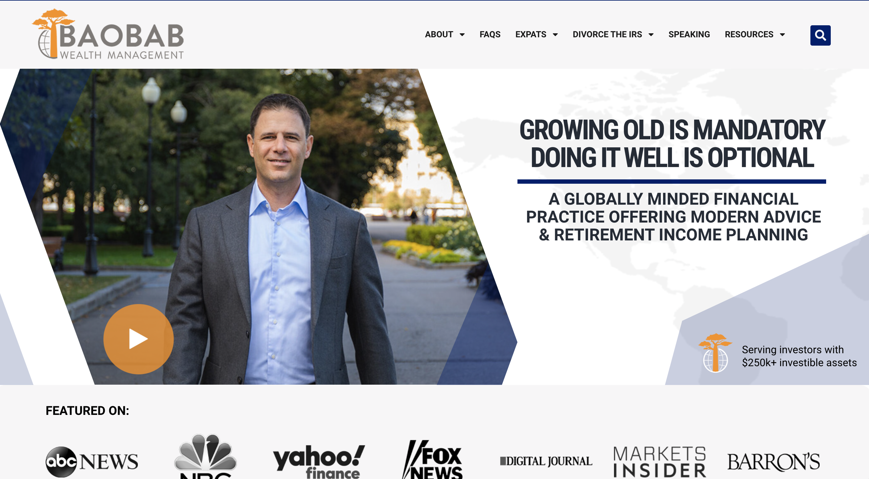
1. Baobab Wealth Management | baobabwealth.com
Why It Works: It might seem counterintuitive, but sometimes giving away your insights for free can be a great way to attract leads and show off your value. Baobab Wealth Management does just that right on their homepage, offering a downloadable Retirement Handbook and the first chapter of CEO James Miller’s “Divorce the IRS” book at no cost.
The site further engages users with an innovative feature – a countdown timer indicating the next tax increase, emphasizing the importance of timely financial decision-making and underscoring Baobab’s commitment to keeping clients well-informed and prepared.
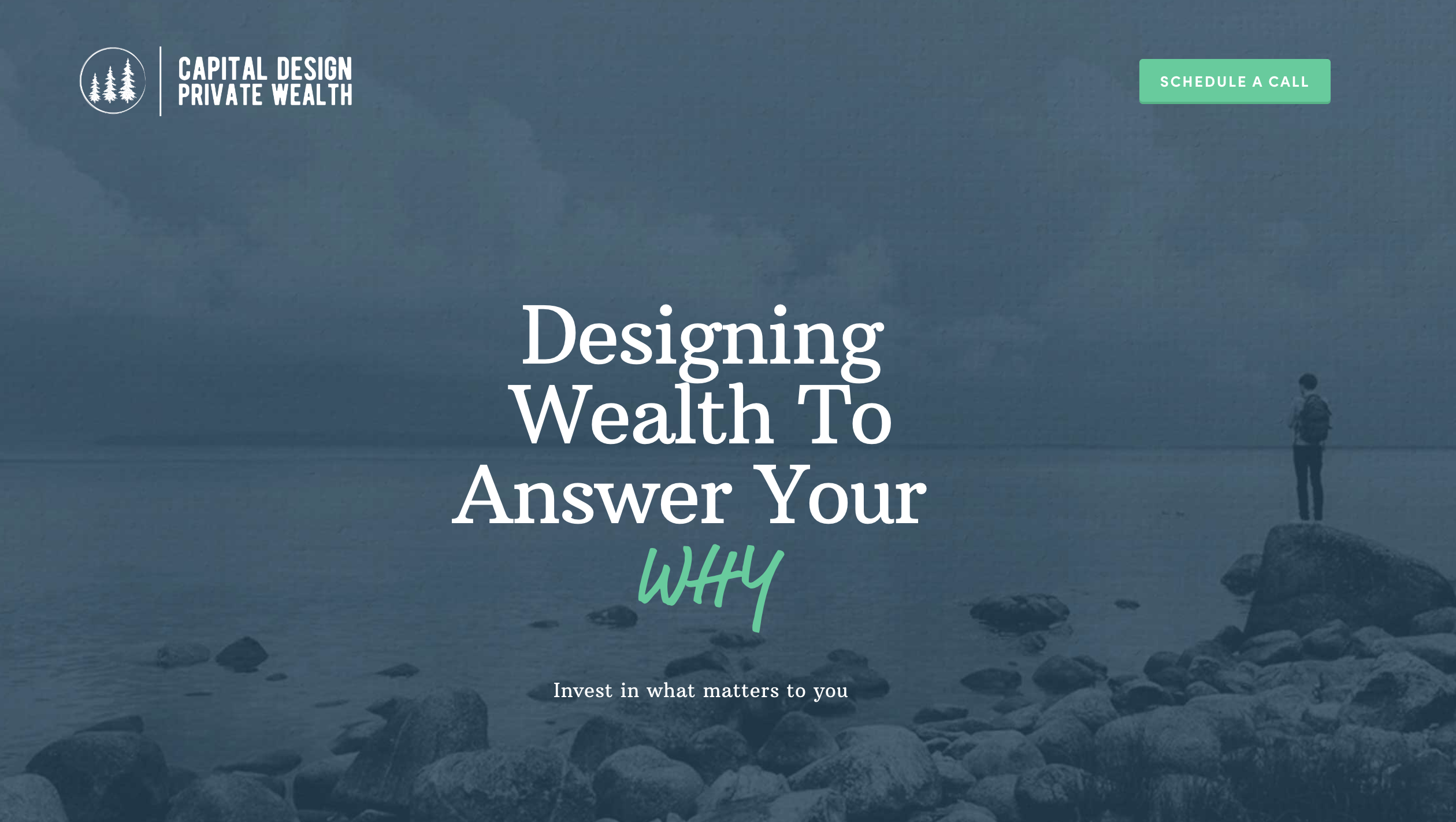
2. Capital Design Private Wealth | capitaldesignpw.com
Why It Works: FinTech marketing expert Samantha Russell recently posted, “If you want to be good at marketing, just constantly repeat ‘it’s about THEM, not about ME.’”
Capital Design has embedded that idea into their website’s copy, starting with the tagline “Designing Wealth to Answer Your Why.” In fact, they use the word “you” over three times more often on their homepage than the word “we!” This, combined with the clear website copy sets a tone of proactive and positive financial planning.

3. Cetera | cetera.com
Why It Works: Cetera has a wide range of ideal clients, including advisors, tax professionals, financial advice-seeking individuals, wirehouses and more. So how do they make their website work for all of these groups?
The Cetera website embraces a “choose your own adventure” style homepage, in which site visitors are easily directed to the parts of the website built specifically for their needs. If you have a wide range of client personas, this is a great way to address all of them!

4. Stash Wealth | stashwealth.com
Why It Works: Stash Wealth’s website is a masterclass in targeting strategy, specifically tailoring graphics, content, and language to engage ‘HENRYS’ (High Earners Not Rich Yet), demonstrating a keen understanding of their ideal and specific client base. From the homepage’s title of “Not Your Father’s Financial Advisor” to each page complimenting their mission, it all collectively builds trust and resonates deeply with millennials.
If your firm targets a specific type of client, consider employing Stash Wealth’s strategy of targeted communication and social proof through client testimonials.
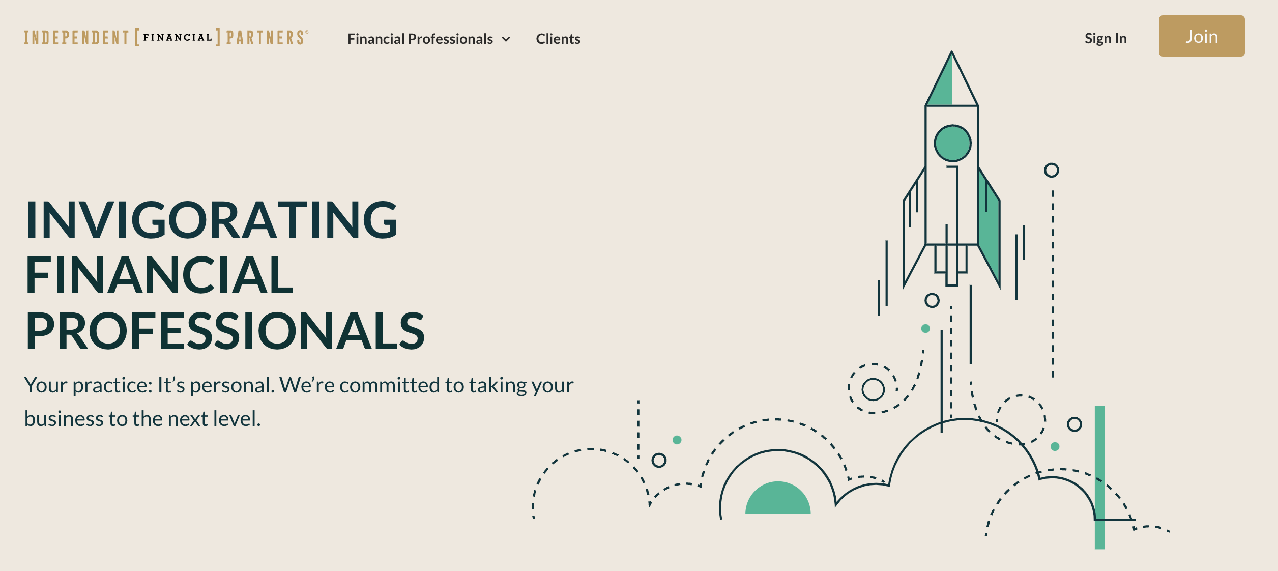
5. IFP Securities | ifpartners.com
Why It Works: Did you know that referrals have the best conversion rate in the financial services industry? That’s why marketing tactics like testimonials (now allowed by the SEC) are so valuable.
IFP’s carousel of advisor testimonials lends their organization more credibility, especially since the quotes are next to pictures of the real advisors that submitted them. If you’re hoping to increase your prospects via your firm’s website, testimonials might be the way to go.
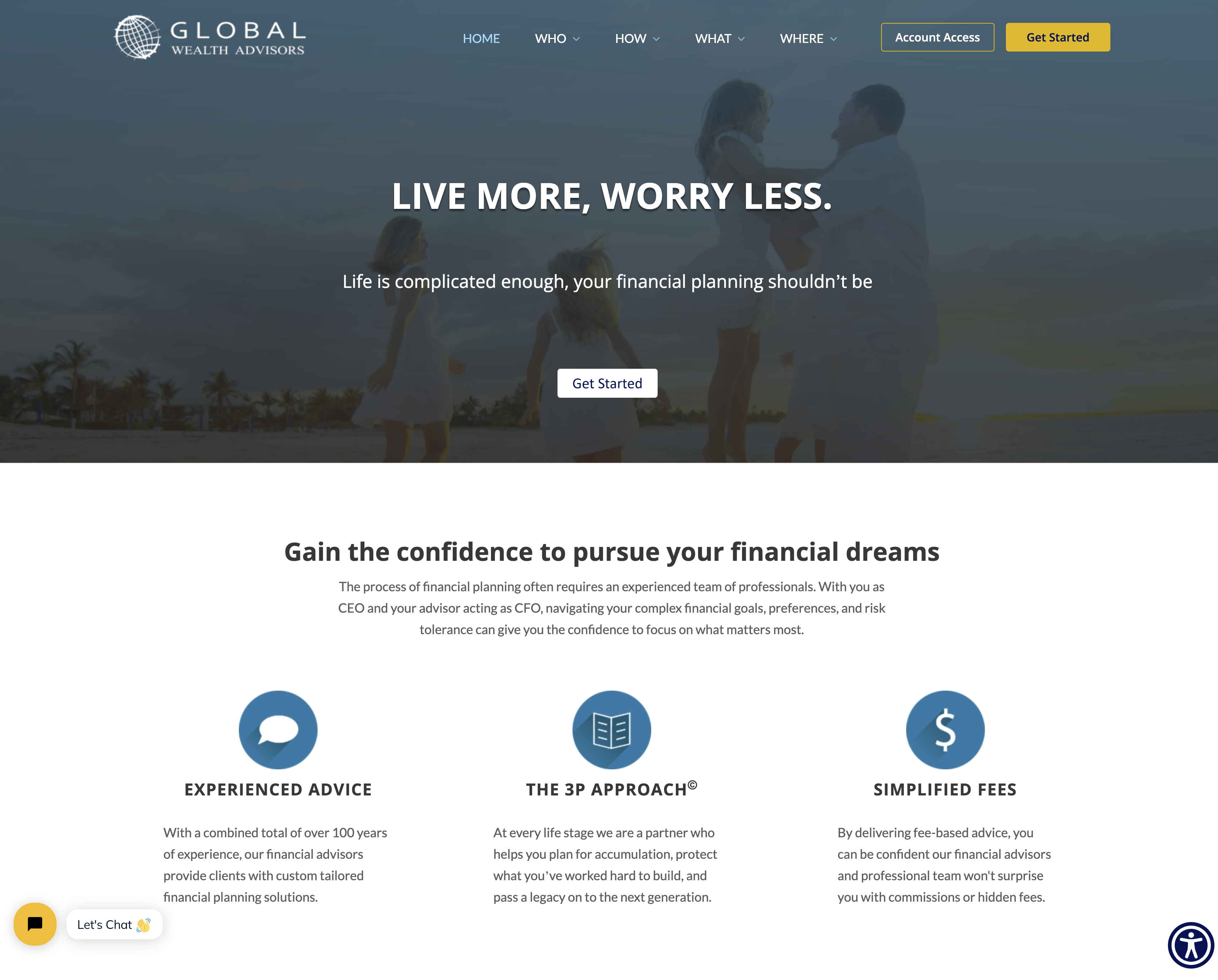
6. Global Wealth Advisors | gwadvisors.net
Why It Works: Even though a human touch is always best in customer service, there’s a time and place for chatbots, too. In fact, 87% of people rate a typical chatbot interaction as neutral or even positive.
Global Wealth Advisors has a handy chatbot in the left-hand corner of their site, just visible enough to be noticed, but without interrupting the site experience. When a chatbot is integrated into your site appropriately (like GWA has done) it can help clients find answers more quickly, keep visitors on your site longer and help you collect information on prospects!
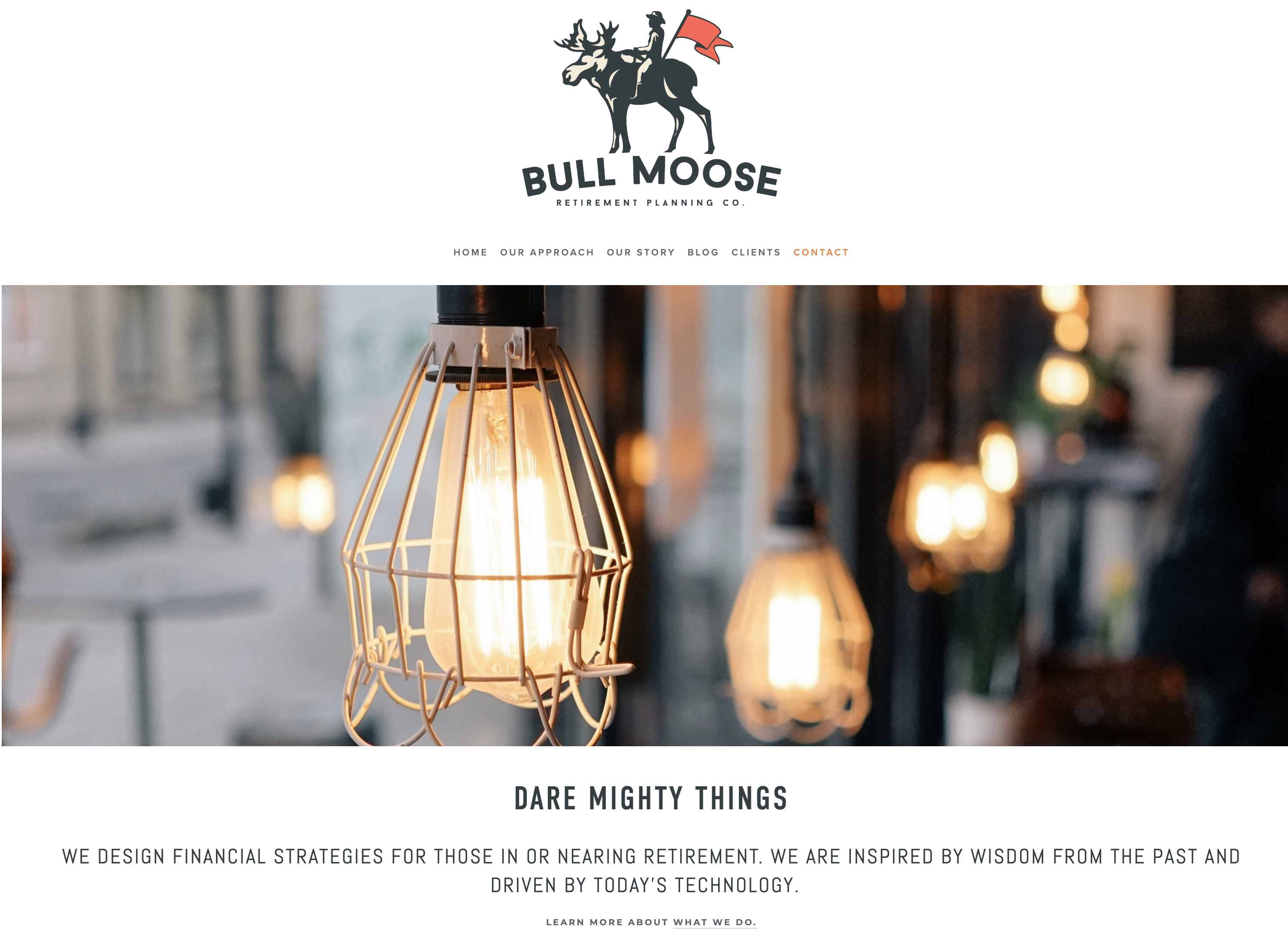
7. Bull Moose Retirement Planning Co. | bullmoosewealth.com
Why It Works: Bull Moose Retirement introduces themselves with a classic, American aesthetic. The website uses clean design and high-resolution pictures to show quality – which can be a handy tool in demonstrating competency. “After all, if their site is good, I bet their other services are just as good…” Their message also describes their specialty: financial strategies for those in or nearing retirement. No-fuss, no muss (like Teddy Roosevelt himself).

8. Matthew James Tax & Wealth Management | matthewjames.com
Why It Works: The biggest standout on Matthew James’ site is a little button right next to their “Schedule a Call” CTA – one that simply says “Start My Plan.”
When visitors are interested in learning more about Matthew James, but aren’t quite ready to make a call, they can take a three-minute quiz and receive a complimentary Retirement Financial Plan, sent directly to their inbox. They also have access to the Nitrogen Risk Number® questionnaire right from the MJ homepage.
Putting interactive quizzes like these on your site can help you collect prospect information, boost engagement and even increase your conversion rate.
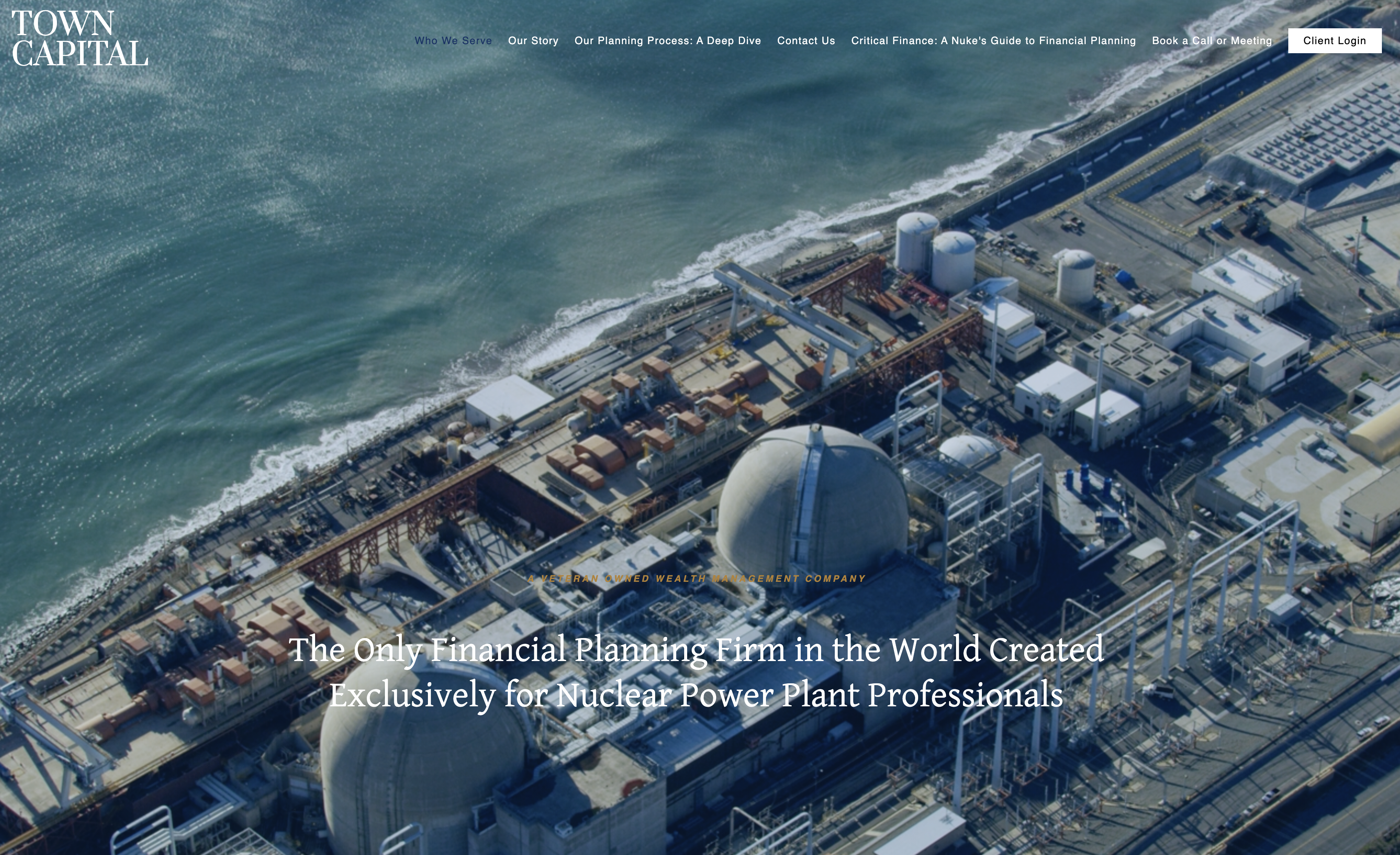
9. Town Capital | towncapitalllc.com
Why It Works: You’ll notice many top financial advisor websites on this list succeed by deeply engaging a specific target client rather than attempting to appeal broadly. Specializing in a particular niche allows advisors to emerge as leading authorities in their field, leveraging unique growth opportunities where their expertise meets financial advisory needs.
Town Capital exemplifies this approach, targeting nuclear power plant professionals. This focus is immediately evident upon visiting their website, where every element, from the tagline to the copy and imagery, reinforces their unique position in the market. For advisors serving distinct industries, Town Capital’s strategy of integrating their niche into every aspect of their website offers a compelling model to emulate.

10. Bush Wealth Management | bushwealthmanagement.com
Why It Works: Visitors to Bush Wealth Management’s website are immediately greeted with a stunning hero video, which sets a dynamic and engaging tone right from the homepage. It complements the site, which is both visually appealing and effortlessly navigable.
The prominent display of their accolade as a ‘Top 100 Advisor’ by AdvisorHub not only elevates their prestige but also serves as a powerful testament to their expertise and trustworthiness for potential clients.
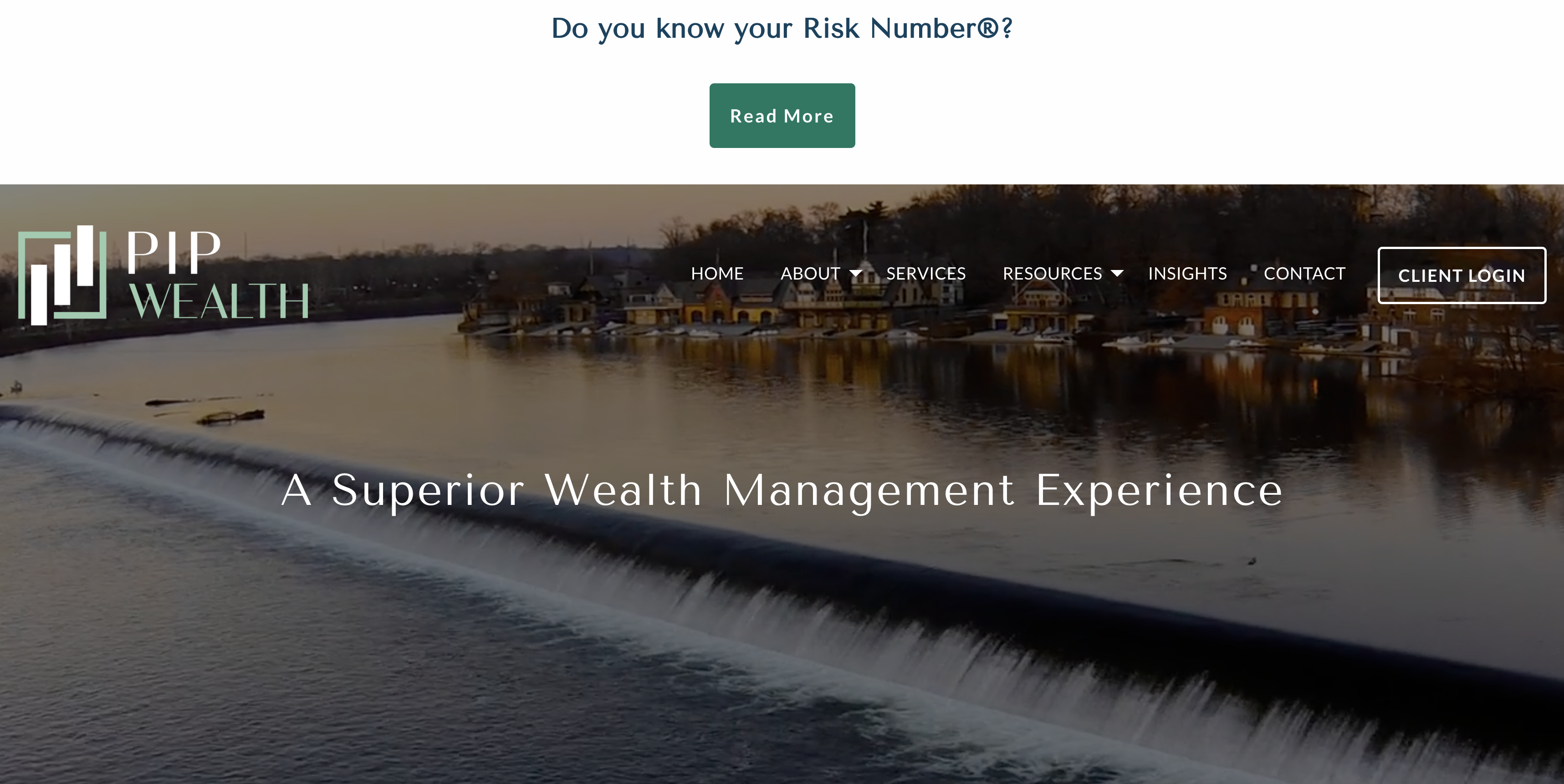
11. PIP Wealth | piplp.com
Why It Works: “Do you know your Risk Number®?”
When you visit the PIP Wealth website, that question is likely the first thing you notice – it’s in bold, large letters across the top of the screen, even above their menu bar.
Putting a question front and center on your site is an effective way to pique curiosity, boost engagement and promote self-reflection. That strategy also fits in well with PIP Wealth’s homepage copy, which focuses on personalization and individuality.
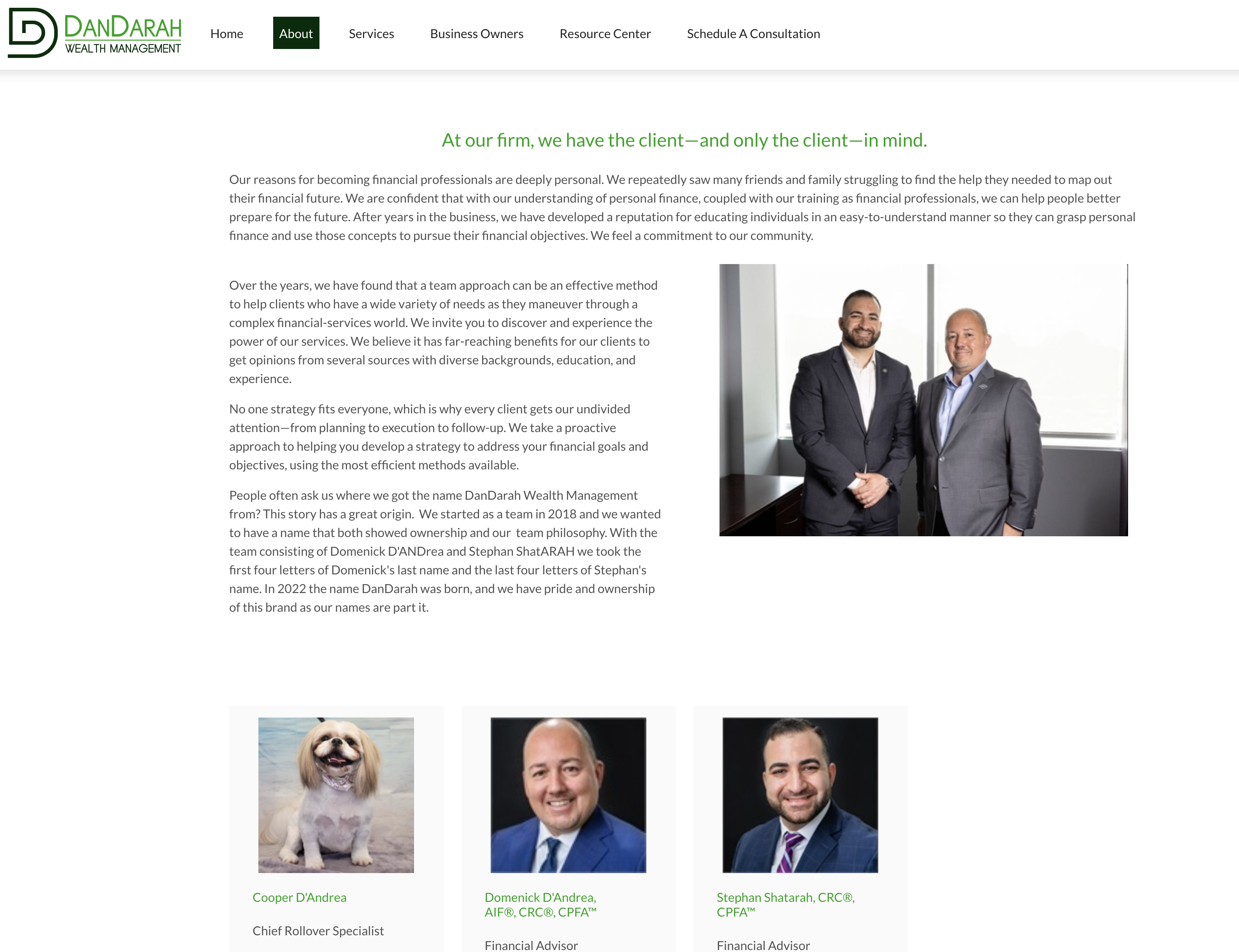
12. DanDarah Wealth Management | dandarah.ceterainvestors.com
Why It Works: Can you guess which of DanDarah’s staff loves belly rubs, taking daytime naps and guarding their office from rabbits?
That would be Cooper D’Andrea, DanDarah’s own Chief Rollover Specialist!
While the majority of your staff is likely human, it might be worth your while to “throw a bone” to any four-legged team members. By putting a pup on their staff page, DanDarah is showing personality and offering an opportunity for connection. After all, over 65 million households in America own at least one dog!
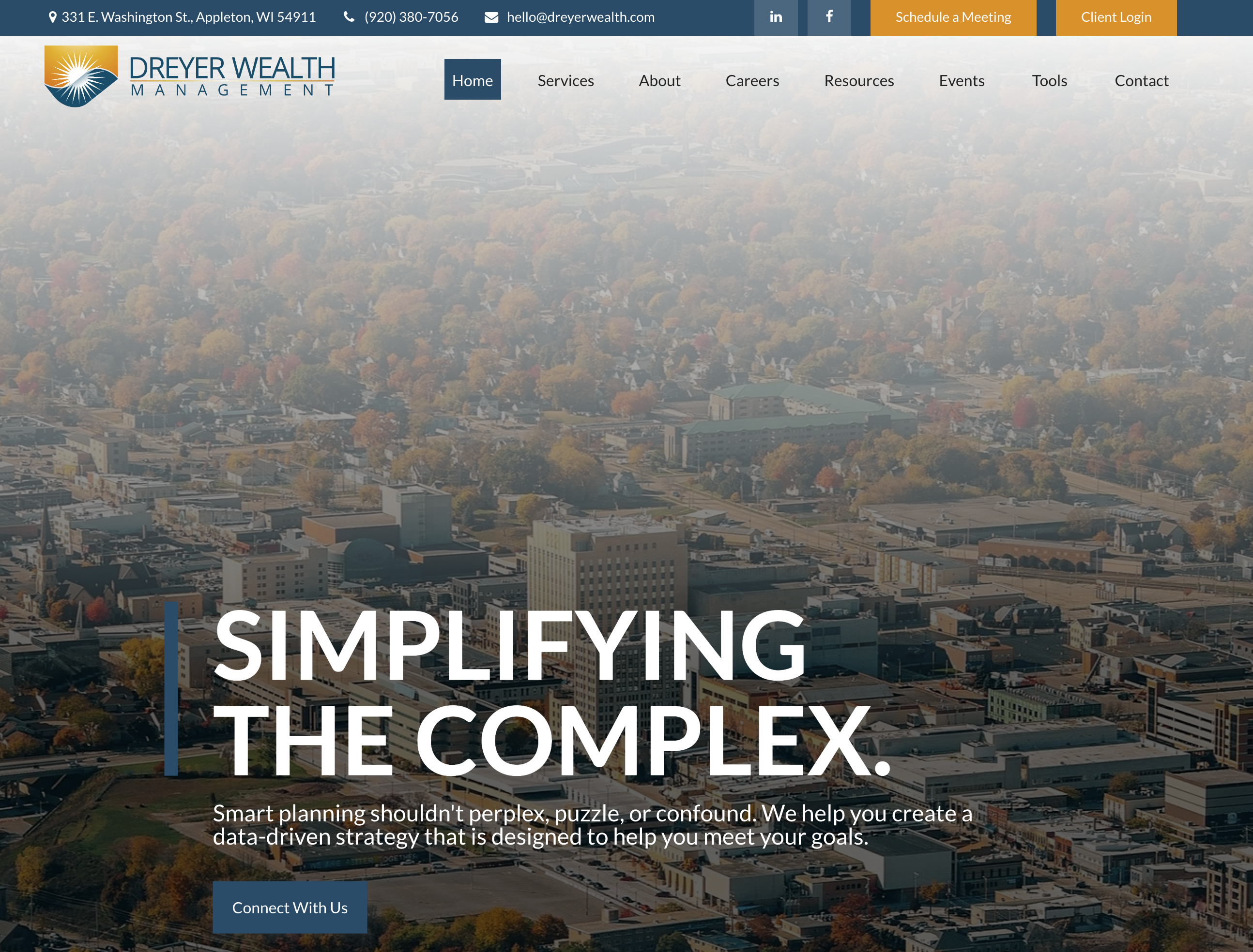
13. Dreyer Wealth Management | dreyerwealth.com
Why It Works: If there’s one thing every advisor website should absolutely have, it would be a clean, intuitive interface. If a prospect can’t find a way to contact you, you might be losing out on potential business. Similarly, a confusing page structure could annoy visitors and leave them with a bad impression.
The Dreyer site exemplifies a strong user experience with clear CTAs, contrasting colors and short, bold copy. All of their contact information is visible along a top bar, and their menu is organized in a simple, straightforward way.

14. Good Financial Cents | goodfinancialcents.com
Why It Works: Good Financial Cents stands out for its use of clear, relatable language that resonates with the average investor, exemplified by straightforward menu options like ‘make money’ and an engaging homepage statement: ‘I teach people insanely actionable wealth building strategies to increase income and work toward financial freedom.’ This approach demystifies financial concepts, making the site exceptionally accessible and appealing to those seeking practical advice on wealth building and financial independence.

15. CUSO Financial | cusonet.com
Why It Works: None of your marketing materials – be it your website, advertisements or social media – would be possible without the power of proper disclosures.
But fitting disclosures into your website can feel like a complicated puzzle. Are they prominent and visible enough? Will they distract site visitors?
CUSO Financial is taking a new approach to that problem by placing a section just for disclosures along the top menu bar of their site. Regardless of what page you’re on, you can easily click and see whatever disclosure you need. In the age of ever-increasing compliance, this straightforward and transparent approach is refreshing, which prospects and clients might appreciate.
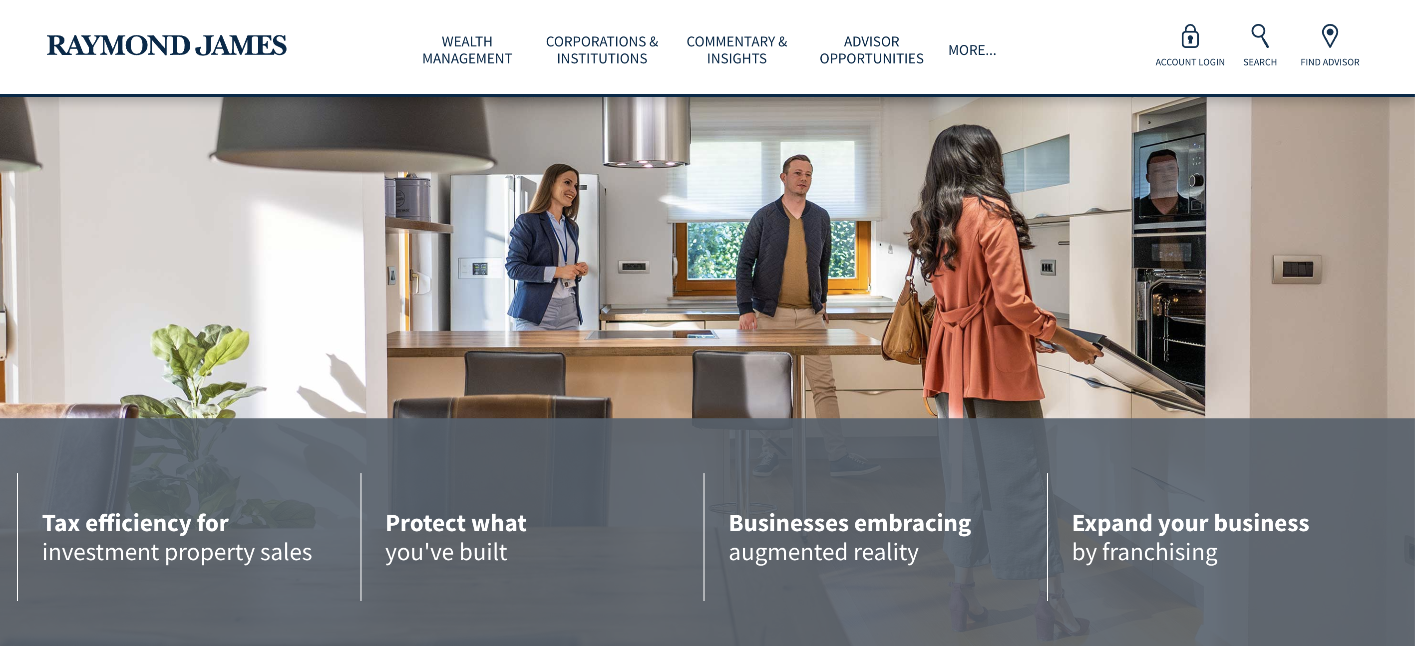
16. Raymond James | raymondjames.com
Why It Works: Raymond James’ website mixes old-school sophistication with sleek, tech-inspired images, bringing a professional and established feel to their firm.
Their site reminds us that while bright colors and hyper-niched brands are increasingly common, there’s also room for traditional, muted hues and a focus on business. In fact, this clutter-free approach can give your firm a more established, authoritative feel, which may increase trust with prospects.
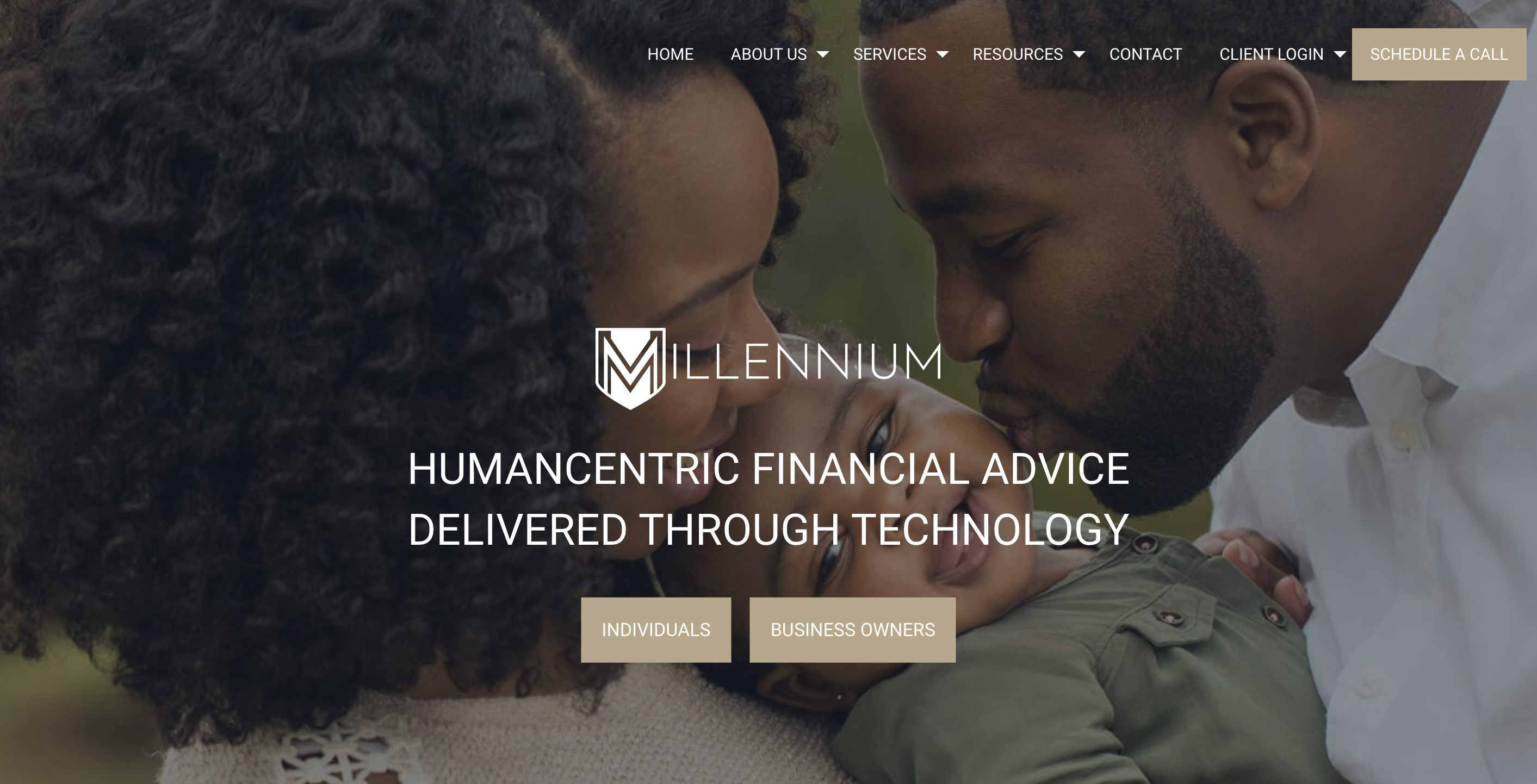
17. Millennium Planning Group | mpgplan.com
Why It Works: One of the first words you’ll see on Millennium Planning Group’s website is “humancentric.” Nearly every single picture on the site features smiling faces of families spending time with each other, and their About page states how important it is for their advisors to really get to know clients. Yet, the majority of MPG’s client interactions are totally virtual and they operate on a 100% paperless basis.
Many tech-first firms would have chosen sleek, software-heavy images and copy – but the MPG website is a stellar example of how firms can break the status quo in their digital messaging to meet evolving needs.

18. Dynamic Wealth Advisors | dynamicwealthadvisors.com
Why It Works: You don’t have to develop your own quiz to put interactive elements on your advisor website. Dynamic Wealth Advisors accomplishes that engagement with colorful cards that flip when hovered over, each addressing a different financial planning topic.
They’ve also embedded a Google Maps section where site visitors can enter their own address to find a nearby DWA location – which serves to keep prospects on their site longer and is a simple way to add a little extra value to the overall experience.

19. Investably LLC | investably.com
Why It Works: Sometimes prospects and clients need a little perspective to truly understand the value of a financial planner. Investably gets to the heart of that with a bold YOLO-esque tagline: “You only get one life. Make it a great one.”
Rather than focusing on whatever issues prospects need solved, Investably presents the end result of working with their firm, which they describe as “a sustainable life of abundance and happy moments.”
Combined with free resources and a bright, clean aesthetic, the website is effective at answering all questions before they’re even asked – while also keeping visitors’ eyes on the prize.

20. Moors & Cabot | moorscabot.com
Why It Works: Moors & Cabot has been in business over a staggering 130 years, but they still describe themselves as a sort of startup.
That’s because they’ve built their firm on a long history of future-forward thinking and innovation. When prospects visit their site, they can watch a short video on the firm’s historical roots, and then explore the software solutions Moors & Cabot use to solve clients’ financial challenges.
Their site exemplifies how firms can evolve their processes and services while still retaining the core of their brand – and even turn that evolution into an effective brand story.
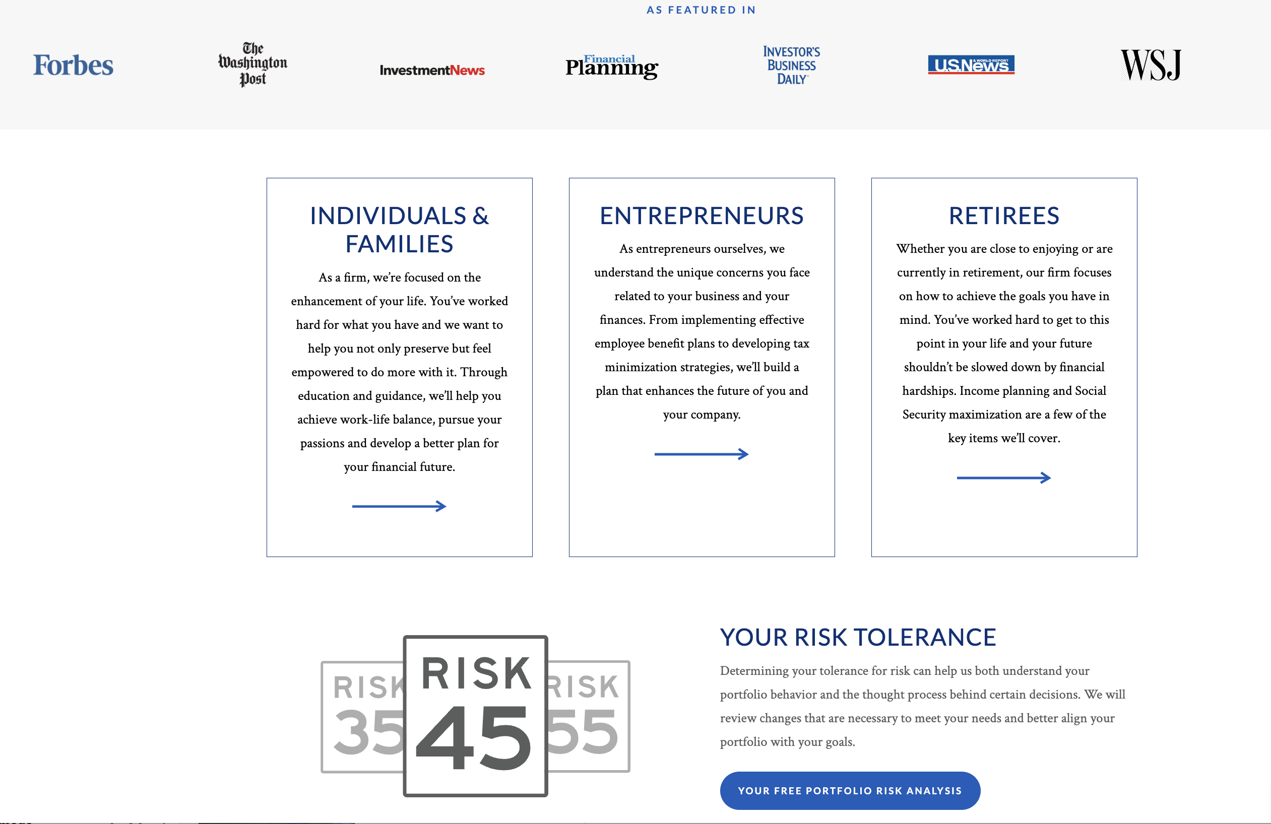
21. AIM Advisors | aimadvisorsnc.com
Why It Works: AIM Advisors stands out as a premier financial advisory firm, earning its distinction through strategic showcasing of notable features in leading publications such as the Washington Post, WSJ, and CNBC, which enhances their credibility and market presence.
Their website effectively caters to diverse groups including individuals and families, entrepreneurs, and retirees, further enriched by offering a complimentary Risk Tolerance Questionnaire, inviting potential clients to engage directly and understand their portfolio risk, an innovative approach blending client education with interactive engagement.
Get Started with Nitrogen
Ready to make your advisor website a lead generation machine? Click here to request a free demo of Nitrogen and learn more about how to transform conversations with the Risk Number.